top of page
Campaign Manager Tool
INNOVID is a software platform that provides technology for the creation, delivery and measurement of TV ads across connected TV (“CTV”), mobile TV, and desktop TV environments.

Context
The Campaign Manager Tool (CMT) is INNOVID's core platform and the operational backbone of the company. It supports the creation, management, and tracking of hundreds of thousands of digital and CTV ad campaigns across multiple environments.
For many internal teams, CMT is the primary workspace used daily by campaign managers, ad operations, analytics teams, and support specialists.
By the end of 2020, Google Chrome announced the discontinuation of Flash support, requiring the entire platform, built over many years on Flash, to be migrated to modern HTML-based technology.
This wasn’t just a technical migration. It was an opportunity, and a necessity, to rethink the entire user experience.
The Challenge
Early attempts to migrate individual screens from Flash to HTML resulted in a fragmented UI and inconsistent UX patterns across the platform.
Screens looked and behaved differently depending on when and by whom they were migrated.
Navigation was outdated, the information architecture was unclear, and workflows had evolved over time without holistic design oversight.
CMT needed a unified experience that could scale with the company and match the complexity of its users' work.
My Role
As the UX designer leading this effort, I was responsible for:
-
Mapping the entire system and documenting existing user flows
-
Identifying experience gaps and inconsistencies
-
Conducting user interviews across different roles
-
Defining UX principles for the new, unified interface
-
Designing updated screens and patterns to support the migration

Phase 1: System Mapping & UX Audit
I began with a complete audit of the system:
-
Cataloged and mapped every screen in CMT
-
Identified duplicate patterns, outdated components, and legacy flows
-
Reconstructed the end-to-end user journeys
-
Analyzed navigation logic, data hierarchy, and the structure of complex workflows
This phase highlighted several key issues:
-
Deep, multi-layered navigation that was not intuitive
-
Repetition of similar actions with different UI patterns
-
Important functionality hidden inside nested menus
-
Data-heavy screens with no visual prioritization
-
Role-specific workflows that were poorly represented in the interface
This mapping became the foundation for the redesign, serving as the first complete visualization of CMT’s structure.

Phase 2: User Interviews & Insights
To validate assumptions and understand real-world behavior, I conducted interviews with U.S.-based users across several roles:
-
Campaign Managers
-
Ad Operations Specialists
-
Account managers
Key insights:
-
Each role had a different definition of "success", which meant different priorities and pain points.
-
Many users developed workarounds to make outdated screens usable.
-
Users often relied on tribal knowledge rather than the UI for navigating the system.
-
The same screen served multiple audiences—often with conflicting needs.
-
There was a strong need for consistency and predictable UX patterns.
These insights shaped the vision for a unified design system and guided which workflows were redesigned first.
Phase 3: Designing the New Experience
Based on the research and mapping, I created the foundation for a modernized, consistent, and scalable platform experience.
Design Goals
-
Create a unified visual and interaction language
-
Simplify navigation and flatten unnecessary hierarchy
-
Prioritize information based on user roles and workflow stages
-
Support data-heavy use cases with clear visual structure
-
Ensure the design can scale with future features
Deliverables
-
Updated navigation frameworks
-
Reorganized information architecture
-
Redesigned screens for core workflows
-
UX patterns for tables, filtering, forms, and content-heavy layouts
-
Recommendations for a foundation of a design system to guide future migrations
The new screens improved clarity, reduced cognitive load, and supported consistent decision-making across the platform.


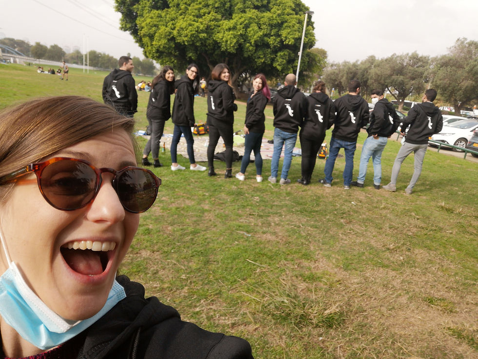
Celebrating success!
Even though the pandemic was here we had to celebrate the hard work and the product launch, so we held a picnic at "Park Hayarkon" while adding some swag to the party.

bottom of page